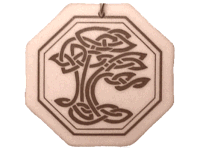
I found an image on an art necklace that I want to adapt for my business logo. It is a Celtic tree that celebrates the provision of shelter, warmth by trees and the tree represents a connection between heaven and earth (branches stretched into the heavens, roots in earth).
As a carpenter crafting trees into shelters and as an person of Irish/Scotish ancestry it seemed fitting. I asked a graphic artist to simplify the drawing, but I think it too simple in the new version. I think I will ask for more of the Celtic knot style…more figure 8’s and points at the end of the loops. I do like both images. I hope for a mix of the two in the next revision.
Both images are continuous lines (no beginning or end) and also represent eternity…kinda cool, me thinks.
Whatdaya think?


Replies
I'm no graphics designer, but I think the interpretation looks like bad modern art. The Celtic design has a distinct feel, but that's lost in the squiggles of the other one.
Jon Blakemore
RappahannockINC.com Fredericksburg, VA
I agree. The level of complexity of the new version is close to what I want, just like the original style better. I guess the original is too busy for embroidering on a hat or that kind of thing...but the new version is too loopy.I hope to find a balance. Simpler, but with the original style.
Edited 11/30/2006 9:25 pm ET by basswood
You bring up a good point about embroidery. We have a version of our logo (check the website linked below) on shirts and hats, it's about 4" long. The house was omitted for clarity and the "Class A" and "Fredericksburg VA" are omitted as well, to make more room for our web address.It doesn't bother me, I think the blue ellipse, our name at the top, and the blue band are the critical elements but it would be nice to have just one version floating around.
Jon Blakemore RappahannockINC.com Fredericksburg, VA
I like your logo, Jon. Not my colors, but I like it nonetheless.
The compliment really should go to Mike Smith. I "borrowed" his rough design (with permission, of course) because I admired his so much.
Jon Blakemore RappahannockINC.com Fredericksburg, VA
I'm amazed at the detail that can be acheived in embroidery. I think the original artwork would reproduce pretty well if you decided to. Looking at samples for some shirts right now... highlights and fine lines are reproduced better than expected. I'm attaching a couple of pics. Logo size is 3"x1".
FWIW, the original seems more organic or something, the stylized is a little to abstact for my tastes. I think Jerald hit it on the head in his description of whom each might appeal to.PJ
Everything will be okay in the end. If it's not okay, it's not the end.
Peter,I'm glad to hear about the detail in embroidery being preserved. I'm hoping to have a logo that has some detail, but is recognizable at a distance as well. I'll post some new versions as they are rendered. Thanks for the input.
Don't take this wrong, bass, 'cuz I like the logo. But there's a part of my brain that's associating it with Smurfs...must be the fluid shape...or maybe my weird mind ;)
Steer clear of blue and you're safe!PJ
Everything will be okay in the end. If it's not okay, it's not the end.
I like it a lot. One suggestion you might consider... instead of having Basswood Home on one line and Improvement below, use a different and heavier font for Basswood, put that on the top line, and then put Home Improvement on the second line.
Basswood
Home Improvement
Of course prospero won't let me delete the blank line between, but you get the idea.
Good idea. Thanks.Big "Basswood"little "home improvement"got it.
i like the logo, for what it's worth. don't think its oversimplified at all.
I think this logo looks great! It's graceful, elegant, and very high end. I not so sure about it's appeal to middle class market but I think it's fantastic if you are going to go after high end clientele. The other artwork (the original design) while good too I think is more "folksy" and "earthy". Both work but I do think the one below has the higher end appeal. I'm not so sure I'll like the logo having "more of the Celtic knot style" look at all. I think that will make it too "heavy" but I'll look forward to seeing it anyway.
I like the font choice too.
View Image
View Image
Thanks for the feedback. Nice to have people with a good eye for graphics and style weighing in.
It has a very arts and crafts feel. It'd fit right in with a Mackintosh piece. If I may be so bold, I think you need a typeface that compliments it a bit better:
this one looks good and says a lot..
Life is not a journey to the grave with the intention of arriving safely in a pretty and well preserved body, but rather to skid in broadside, thoroughly used up, totally worn out, and loudly proclaiming<!----><!----><!---->
WOW!!! What a Ride!<!----><!---->
Forget the primal scream, just ROAR!!!
I like this version of the log design too. I think it "speaks with a different local accent" View Imagethan the B&W one using the avant garde style font I commented on already.
Yes it certainly would fit in with a Mackintosh piece because that's the first thing I thought (Charles Rennie Mackintosh) on seeing the logo type. I may be over intellectualizing in saying it may imply and emphasize Art Noveau and Arts & Crafts specialization (which may be exactly what Basswood wants to do) where the other B&W version is more open ended and broader in it's possible intrepretation.
I say "over intellectualizing" in that most common folk may not even pick up on the Mackintosh, Art Noveau, and Arts & Crafts notes and just think of it as having artistic type with an artistic image. And there's ceertainly nothing wrong with that thinking either.
I'd like to see how it works as a straight B&W image too without the paynes gray/blue background.
I don't think one type face is any better than the other in this case. They are just different and say different things. Both messages I think are high class.
View Image
--"It has a very arts and crafts feel. It'd fit right in with a Mackintosh piece. If I may be so bold, I think you need a typeface that compliments it a bit better:"Darrel,Thanks for the advice...I like the A&C font, very nice.
Dude.... I know jack-diddly about marketing. But this one would definitely catch my eye. Very sharp. Very tasteful.
View ImageView Image
Glad you like it...this is an interesting process. You were working on your logo a couple of years ago IIRC. Can you report on how your "logonization" has impacted your business? What uses of your logo/signs have been most effective?
I generally like it. And the A&C feel along with the A&C typeface.But you might want to look at tightening it up just a bit.If you make the trunk a little narrowere and raise the bottom of the "limbs" where the leave the trunk it might have give a little more reconizion as a tree. But I would have to see it drawn out to know if that was better or not.And I think that the logo is good for thinking like signs, shirts, top of page logos, etc.But in your long form advertising you should have an About Us section that mentions what the logo is and how it fits into your ideas as a craftsman.BUT ONE CAUTION.I did a google on Celtic tree and could not find anything like your orginal. I found celtic knots and celtic trees. But nothing like yours.http://altreligion.about.com/library/glossary/blcelticsymbols.htmhttp://radio.weblogs.com/0126951/2004/05/25.htmlThose appear to be historic and in public domain.I am wondering if the neckless would be a copywrited design and your logo a derivation their of?
Bill,
that is something I really like about you.
something catches your interest--and BAMMM!-- you are off doing research and seeing things through to the end.
By the end of the day--- I fully expect you will have an astonishing knowledge of
a) celtic knots
B) celtic Trees
C) Irish woodworking in the 11th century
D) Logo design
E) the history of typesetting
F)Starbucks- and what it currently trades for on the stock exchange
G) Coffee cultivation techniques
H) the general history of Seattle
you ARE amazing-and a little inspiring LOL
Best wishes,Stephen
Bill,Good to hear your thoughts. I do plan to write a blurb about the logo for a new version of the business brochure. The new brochure will fit in a CD case (like a mini "album" cover & "liner notes") so I can give out a CD-ROM portfolio to certain customers.I found "my" original tree with this google search on the first page: http://www.google.com/search?client=safari&rls=en&q=celtic+tree+of+life&ie=UTF-8&oe=UTF-8The original tree is the intellectual property of a New Age pottery studio...however, given the ancient origin and great variety of celtic tree designs, it seems that creating one that is reasonably unique or at least similar to common domain examples should be doable (even if inspired by the jewelry art linked here). If that is questionable I could contact the jeweler.Perhaps this could explain why the new version rendered by my graphic artist is more unique than I expected...he may understand how to keep out of trouble or may just be expressing his own creativity. I will bring up the subject with him.Thanks,Basswood
I really can't tell you.And I think that each art form and type of each expression will be treated differently.You have heard the commical show where there is a "contest" to name that song and then they bid for the minimum number of notes.Well I have heard that copy write law suites on songs are about that bad. they will often count the number of notes that are idential.Or might have a common theme, but they they divert.Now in thie case there are clearly elements that have been in public domain for 100's of years. But also you can't take a copywrited work of art and make minor changes and call it different. For example . Changing one of the cross overs from left over right to right over left. Or in the cause of house plans changing the garage by 15 ft and adding a 3rd door.
basswood,
please let me know how the cd-rom portfolio works out
I was actually thinking about much the same thing about a year ago--it has some huge advantages and I would like to hear if you actually put it together.( I am still collecting pictures for mine,LOL)
Stephen
Edited 12/8/2006 2:31 pm ET by Hazlett
Not to hijack the thread, but, if I may ;o), jerrald...how do you get the images to show up as part of the post rather than just an attachment?
Well Darrel I use Dreamweaver to compose all my posts but if you want to put an image in your post literally instead of as an attachment you just need to use a little bi of HTML.
What I did was I opened up Basswoods image in it own window and then copied the URL.
http://forums.taunton.com/n/docs/docDownload.aspx?guid=67D891A4-8F20-48A5-A331-37279D62FA44&webtag=tp-breaktime
You would then take that URL and wrap it in quotes and HTML tags so that the Prospero software knows it's an image you want to have appear in your post.
<p><img src="http://forums.taunton.com/n/docs/docDownload.aspx?guid=67D891A4-8F20-48A5-A331-37279D62FA44&webtag=tp-breaktime"></p>
With the code right there what I have told the Prospero forum engine is that the "image source" (the red code) is that URL I plugged in and the blue <p></p> tags have told the Prospero engine that the whole shebang is set off as it own seperate paragraph.
And you then need to check the box where it says "Check here if HTML tags are in the message (not including signature)."
View Image
oh! Ha...I didn't realize this forum accepted plain HTML. Most forums require you use their arcane custom tags. Thanks for the tip!
darrel - " oh! Ha...I didn't realize this forum accepted plain HTML. Most forums require you use their arcane custom tags. Thanks for the tip!"
Yeah that drive me nuts too. You have to remember which forum you are on and what tags will work and what ones wont as well as how they are written. That's one of the reasons why BreakTime (with it's Prospero engine) is my prefered forum.
View Image
I like it.
Bawitdaba da bang da bang diggy, diggy, diggy
shake the boogie said up jump the boogie.
Basswood,
I am a little hesitant to chime in here---- cause if I gave you my full blown , HONEST opinion-- you would probably be offended, LOL.
I will try to exercise a little restraint-----;)
Basically, I don't like it.
Of course, Everything I know about graphic design-- I know from listening to my Dad, who was commercial artist by day--and a landscape artist by nights, weekends and vacations( he pursued these to avocations pretty much 16 hours a day,7 days a week)
My problem with your logo is------- that if you hadn't explained to me WHAT that squiggle was supposed to represent--- I wouldn't have had the slightest idea. I come from a VERY irish catholic background, and i would NEVER put that squiggle together in my mind as a celtic knot---- it's completely out of Context--and there seems to be no conection with Basswood home improvements.
If your logo consisted of the squiggle---followed by O'connor Home Improvements-- i might have picked up on it---- but not the way it is.
Basically-- as explained to me-------a logo, a sign, a letter head, a job site sign---- should convey INSTANTLY what you are all about.- if i was to see your logo------- i might think Baswood Home Improvements--from the text------- but the next thought in my mind would be---- what the hell is THAT supposed to be?--and at that point I am no longer thinking about Basswood home improvements---and a little irritation factor has begun to creep in------and I am no longer developing warm and fuzzy feelings about your enterprise--but more and more antagonized.
If your logo was more clearly a tree--- it would work better--- but is it supposed to be a Basswood Tree ???- how would i know ?
sometimes graphic designers get to "artsy"--and they lose track of what a sign really IS.
for several years I drove by a particular business EVERY school day and saw a sign out front. for 3 years I had NO idea what business the company was in--despite seeing the logo on a sign EVERY day.--After 3 years-one day i stopped--and walked up closer to the sign-- I STILL don't know what the logo was supposed to represent---but at the bottom of the sign--legible ONLY from the sidewalk was very small letters reading " graphic arts".
this was NOT a pedestrian friendly neighborhood, BTW--- the sign was a complete failure--- meant to appeal to drive by traffic--it had been illegible for 3 years.( in those 3 years I had TWICE bought graphic design from other sources BTW)
I apologise if i have come off a bit harsh--- but I think the logo would be more effective for an established brand-- or even a art gallery or coffee house--a physical location. just because YOU like it a lot doesn't mean it's right for prospective customers. A logo is about the customers--not YOU- and I don't think you can expect a prospective customer to emotionally invest in trying to decipher the intended symbolgy behind an illegible squiggle. Even if the tree was more representational-- there is no clear connection between IT and Basswood home improvements
BTW--- Weds, december 13 I am attending " Barcelona & Modernity:Picasso, Gaudi, Miro, Dali" at the CMA--- so I am not opposed to non-representational art
just in this context I find it irritating?, borderline Offensive?, off-putting-- I don't know--some how it would drive me AWAY from your business.
Again-my apologies--and very best wishes to you,
Stephen
"My problem with your logo is------- that if you hadn't explained to me WHAT that squiggle was supposed to represent--- I wouldn't have had the slightest idea."A logo doesn't have to be literal to be effective. A logo really isn't meant to communicate the full breadth of the company. Rather, it's meant to act as a flag...a unique way to visually identify the company.Your example of the graphic arts sign is a good one, but not necessarily an example of a bad logo, per se, but an example of realy bad typography. Clearly, their sign needed legible typography from the street and road (hence my example that uses much larger type).That's not to say it's not useful to sometimes use literal logos. A Dentist may very well want a big tooth on it's logo so it's easy to spot 'as a dentist' in the yellow pages. The one drawback to literal logos, however, is that much of your competition is likely using the same concept, so you loose some uniqueness (I'd guess 3 out of 4 contractors/builders have a house in the logo, for example).In the end, it's not your logo that builds your brand awareness, but rather it's yourself, your work, and your marketing. The logo then represents and solidifies the brand awareness you've built. Granted, it helps to have a good looking logo to start with.Regarding this, as I had mentioned, it has a very strong Rennie Makintosh feel, so it certainly puts it into the 'craftsman' camp. That said, if all the work this company does is industrial welding or modern scandinavian cabinetry, the logo is perhaps less applicable.
darrel - "A logo doesn't have to be literal to be effective. A logo really isn't meant to communicate the full breadth of the company. Rather, it's meant to act as a flag...a unique way to visually identify the company."
That was my point too and perhaps better said than I put it.
"That's not to say it's not useful to sometimes use literal logos. A Dentist may very well want a big tooth on it's logo so it's easy to spot 'as a dentist' in the yellow pages. The one drawback to literal logos, however, is that much of your competition is likely using the same concept, so you loose some uniqueness (I'd guess 3 out of 4 contractors/builders have a house in the logo, for example)."
Funny that's exactly one of my main complaints about our logo too. I designed the icons originally as part of the navigation on our website way back when and they eventually worked their way into our brand identity and perhaps only because we are recognized by the collection of icons I haven't worked to on anything to move away from them. They may very well work great for us but whenever I see another contractor with a house or hammer or paint brush I always cringe a little and wonder.
"In the end, it's not your logo that builds your brand awareness, but rather it's yourself, your work, and your marketing. The logo then represents and solidifies the brand awareness you've built. Granted, it helps to have a good looking logo to start with."
That's certainly the branding part. Good logo or bad logo people will eventually stick or tie their impressions of their "experience with your company" to that image and the logo becomes just a symbol of your brand.
Brings to mind a discussion I had with Andy Clifford regarding his tipi. Some people, who will remain nameless becuase I don't want him to get into any kind of trouble with his wife Katrina, were questioning or wondering about his use of tipi artwork since he doesn't build tipis. My point in his defense was it wasn't about building tipis, the tipi logo is just a symbol that people will then attach to whatever they think of Andy Clifford and his work.
View Image
View Imagedarrel - "A logo doesn't have to be literal to be effective. A logo really isn't meant to communicate the full breadth of the company. Rather, it's meant to act as a flag...a unique way to visually identify the company."
More thinking on this I was just reminded in talking to Andy again about his tipi that in support of it I brought up just what the heck does a mermaid have to do with Starbucks coffee? And yet is is one of the most reconizable iconic symbols in America today and everyone has thoughts on what it means and represents.
And how did "Starbucks" work it's way into the company name? (see Wordlabs Free Naming and Branding Consultants and Resources page)
View Image
From: Hazlett - "I am a little hesitant to chime in here---- cause if I gave you my full blown , HONEST opinion-- you would probably be offended, LOL.
I will try to exercise a little restraint-----;)"
Stephen I don't contrary criticism hurts at all an is actually very valuable so I think it a good thing you chimed in. I think it's funny when I ask for criticism for any artwork, design work, or software I develop it's the negative criticism I often value the most. In terms of gaining an understanding of what you are doing and what you are trying to archive the people who tell me what I did "looks great" actually drive me nuts. I also want to understand and know why something I did didn't work for someone or why it wasn't as good as it could possibly be. I may totally reject and discard that criticism but I learn a lot from hearing it.
That said while your criticism is very valuable and important for Basswood to hear I have to really disagree with your accessment.
"Basically-- as explained to me-------a logo, a sign, a letter head, a job site sign---- should convey INSTANTLY what you are all about.- if i was to see your logo------- i might think Baswood Home Improvements--from the text------- but the next thought in my mind would be---- what the hell is THAT supposed to be?--and at that point I am no longer thinking about Basswood home improvements---and a little irritation factor has begun to creep in------and I am no longer developing warm and fuzzy feelings about your enterprise--but more and more antagonized."
View ImageI think this version of the Basswood logo does a great job of conveying what he all about if what Basswood is all about is "artistic quality", "elegance", "effortlessness" and "grace". It contemporary while still harking back to designs form the early part of the last century. Interestingly the first word that came to mind when I saw this version of the logo was "sterling". I think that's pretty good coming from a black and white logo design. I made me think of the sparkle, shine, and quality of sterling silverware and in fact looks like a imprint you might see on the bottom of a fine piece.
I actually don't like the use of the phrase "Home Improvement" in a company name in that I think it really sort of pedestrian and middle market and that not where we are or what we do. I'm in a real high end market here and I've actually had clients tell me they don't even call "home improvement" companies because of the prejudices they attach they attach to the phase.
Parenthetically that's not to say using "Home Improvement" in a company name is always a bad thing and in fact in some cases it's use is ideal.
But my point is I think the level of artistic quality of the logo design per se for me elevates the "Home Improvement" phrase past any prejudices I have against it.
The logo doesn't tell me anything about what Basswood does but to me it gives me a very clear impression of QUALITY of what is he does.
But here is a real and maybe the most important point. I did get a good feeling about his company from the logo where you were ticked off and annoyed by it. If Basswood is selling his services to Stephen Hazlett he starts off on the wrong foot, if he is selling to Jerrald Hayes he starts off on the right foot. It's different strokes for different folks. What he chooses for his logo design depends upon who he thinks he wants to reach.
I've been talking with some of friends saying that in another five of ten years I like to leave my company and start another company that specializes in low income housing. I wonder would I use a logo like that? On the one hand I can intellectualize and say it help to add "class" to low income housing but on the other hand I might really be missing my market thinking that.
"If your logo was more clearly a tree--- it would work better--- but is it supposed to be a Basswood Tree ???- how would i know ?"
Why would it work any better is looked more early like a tree? If I was to see it more clearly as a tree I might then think he's a horticulturist or arborist.
" for several years I drove by a particular business EVERY school day and saw a sign out front. for 3 years I had NO idea what business the company was in--despite seeing the logo on a sign EVERY day.--After 3 years-one day i stopped--and walked up closer to the sign-- I STILL don't know what the logo was supposed to represent---but at the bottom of the sign--legible ONLY from the sidewalk was very small letters reading " graphic arts"."
I think I can argue in this case that that graphic design company's logo did just what they wanted it to. The point was not to tell everyone what they did. The point was to be memorable. And it evoked enough curiosity on your part that you actually stopped to look.
"this was NOT a pedestrian friendly neighborhood, BTW--- the sign was a complete failure--- meant to appeal to drive by traffic--it had been illegible for 3 years.( in those 3 years I had TWICE bought graphic design from other sources BTW)"
You're making huge leap there in thinking the sign was even intended "to appeal to drive by traffic" in that is most certainly wasn't. Advertising to drive by traffic is hardly the way a graphic design company markets and sells their product. They're not selling retail. The sign was probably designed and placed there as a recognizable symbol for their clients and prospective clients that they have already approached to recognize when looking for their office.
View Image
you spoke using words like effortlessness, grace, elegance, Artistic quality etc.
thats well and good--but if Basswood is using a tree as a metaphor to convey these qualities------- I ought to at least recognise it as a tree. It can be a bit abstract--but I ought to recognise it as a tree. ( there is a show on PBS--perhaps" NATURE" that does this well.
Regaurding the use of Home Improvements-- that's the only thing that gave me the slightest clue what basswood was about. I would stay away from that as well though--because to me I see "home improvements" and I INSTANTLY assume vinyl siding,vinyl windows, Blech !------- thats not the market Basswood is aiming at.
In my own case I chose Hazlett Roofing & Renovation Ltd.---at the time I was planning to use the roofing to generate Cash--and move into buying and re-habbing houses-- I wasn't planning to be in roofing all that long. what ACTUALLY happened was that use of the word" roofing" was too effective--that part of the business EXPLODED with possibilites to the point that it overwhelmed" renovations"-- at the time my work was much more balanced-- but it quickly became overwhelmingly skewed towards roofing to the point that today I am struggling to drastically wrench it back in more of a direction I want to go.------- If I had to do it over again---20/20 hindsight?--- I would have chosen Hazlett Restorations Ltd, or Hazlett Home Restorations Ltd-- something like that
Regaurding Tree/ arborist etc.----- It's not at all clear to me that it IS a tree. If it IS clear to me that it's a tree and his simple Text reads "Baswood Home Improvements "- that pretty much gaurantees that among even a semi-literate populace his customer base won't confuse him with a tree trimmer. We can safely assume his customer base can read---------- I don't know if we safely can assume they will pass the rorchat test-- decipher that's a tree and emotionally impute "effortlessness, grace, timless quality "etc. from it.
Regaurding the Graphic arts sign I described ?------ IMHO--- it was a disasterously bad sign. Remember it took THREE years of me seeing it EVERY day to learn what they were about--AND unreasonble effort on my part. Would I ever do business with a graphic arts business that can't produce a simple sign????? they demonstrated their incompetence to produce the very product I would be depending on them to accomplish.-- It would be like me advertising" all my roofs leak"---hire me!!!!!, rediculous.
further---keep in mind that during the 3 years I saw the sign every day----- I was actively in the market several times for graphic arts services, thinking about graphic arts etc.--------- I spotted that company a huge advantage--and they failed to connect--in fact I STILL don't know the name of the company. I could have stopped and walked in---- but what if I wanted to go home and CALL them--- how would I reach them. to this day you could but 10 graphic art logos in front of me and I couldn't pick theirs out of the lineup.
In an other one of your posts---- you mentioned and showed the starbucks logo
that's interesting--- however------ extract the little center emblem from the surrounding STARBUCKS text---and the distinctive green color----and I don't think anybody would associate that emblem with Starbucks
Also---- if you read my first post to Basswood---- it's a little interesting(to me)-- that i mentioned his "tree" would be more effective in a coffehouse, or art gallery context.
I realized this morning WHY that is.--Here locally, most of the cofee houses are using "to-go" cups that I think they must buy from the same distributor------ they all have an emblem on the cup that reminds me of Basswoods' tree------- the coffee cup emblem features a picture of a coffee cup with steam rising up off it----- Basswoods "tree" reminds me of that steam!------ so----- if I were to see Basswoods emblem----- subconciously I would start looking for a coffee house----and the furthest thing from my mind would be quality woodworking !!! LOL
Gawd I have fiddled away a lot of time here this morning---- got--to--run !
stephen
Stephen,Thanks for taking your time to put your opinion out here...I do appreciate your thoughts. Did you like the original image better?I am OK with making people do a double-take, but don't want the logo to be too wierd. There will be some further revisions...so I hope you will weigh in on those as well.
Basswood,
I just wanted to say-------- I am glad you were cool with hearing an opinion different from the ones you were maybe HOPING to hear LOL
A lot of times on this forum---somebody asks for an opinion( with their mind already made up)--and then they go ballistic when they hear things counter to their opinion.
I think your" tree" is really more of a Rorchat test( ink blot thing ?)
I am kind of intrigued by how people looked at that and instantly got Arts& Crafts out of it---'cause I never did.
I am just not seeing the thing as a tree--- only after it's pointed out that it's a tree am i ever going to see it as a tree. Of the 2---personally i prefer the original as a work of art------- I just don't find it appealing as a logo.
After my first post to you----- I drove my son up towards Toledo, Ohio for a music audition-- then drove him home-- then slept for 4 hours----- then got up at 1:00 AM and drove down 6 1/2 hours to elizabethtown ,KY for a funeral( fortuitously missing sister#2 punch sister#1, LOL) then immediately turned around and drove 6 1/2 hours home---- I maynot be thinking currently as clearly as I would like--from all the driving---------- but it is good to be back among rational folks--instead of among the medicated and mentally ill :)
somewhere on those trips I passed a sign which had a oak tree at the top and text underneath something like "oakhill prebyterian church"------ the branches of the tree were kind of sheltering and protective of the text---------a little trite--- but the logo clearly conveyed what it intended to convey-----not my taste--but effective to it's purpose
also on the trip--several times I passed oak trees alone in a field-- most memorably--one in KY.---Leaves are down, branches exposed, shaped by the elements---a very bonsai sculptural element to it. At the time, I thought incorporated as a work of art the tree would be immensely appealing to me--- but I wouldn't use it as a logo
the tree I overwhelmingly preferred- the bonsai form-------- would not have served the same purpose as the oakhillpresyterian church tree.
YOUR tree-- i just don't see as a tree. the folks HERE that are picking it up as a tree---and making the arts&crafts connection????--are they actually gonna be your customer base?Perhaps they are more educated,experienced and knowledgeable in the Arts& Crafts Genre than folks you might reasonably be targeting as your customer base ?
my personal woodworking leans mu ch more toward arts/crafts, shaker, japanese aesthetics---and steers well clear of more florid, colonial and other styles--------- but I am just not picking up on an arts/crafts thing here. ( my last project like this was aquarter sawn white oak table incorporating handmade tiles in the top from moravian tileworks in PA-- it was made specifically to set in front of a moravian tileworks fireplace surround & between 2 arts& crafts sofas-- sort of a Stickley thing going on---------- so I am a bit mystified how I am entirely missing a a&c thing with your Tree ?
got to run-'cause I want to argue with Jerrald for a minute before I get to work this morning- i am very,Very,VERY busy this week.
Best wishes to you,Stephen
it's an irish tree, ya bastidMike Smith Rhode Island : Design / Build / Repair / Restore
Stephen,I was gonna tell people, who ask what the logo is, that it is an image showing what my extension cords look like at the end of the day. ; )As far as contary opinions go, few here seem to be afriad to have an opinion and they are all over the map. You are right that people who ask for input usually just want affirmation...few of us are really as open-minded as we think we are (of course, some are so open-minded that their brain fell out).It amazes me that if places, businesses, churches, etc. are named for a tree, that it is usually an Oak...I'm goin' against the grain.People here had my logo introduced to them as a tree. You may have a point, had I not specified, I wonder how many would have said, "Cool tree, man!" vs. "Whatzat??? On the other hand, I might like being mysterious.As far as Arts & Crafts style goes, it is really more Art Nouveau and only loosely so (the two styles do overlap though). The font really helps make sense out of it (go darrel).Thanks for sharing your time and thoughts, both in this thread and in general (your info in the mag on valley flashing was very helpful a couple of months ago--I got rid of a pesky leak on a customers roof--and "I don't do roofs.").Have a good week (I get to be a painter/tile setter/cabinet installer this week),Basswood Brian
I like it. I would normally want the logo to convey what the business is doing, however you achieve this with the "home improvements" in the business title. It does led itself to the "artsy fartsy" crowd, but is that a bad thing? Plus, it could be a great conversation starter.
go for it. I think it is cool.
knowledge without experience is just information.... Mark Twain
Politicians, like diapers, need to be changed often...and for the same reason. (bumper sticker)
http://www.cobrajem.com
Hey Chuck,--" It could be a great conversation starter. go for it. I think it is cool."I think both versions of the logo are a little "out there". I guess I think it can be good for people to have to look twice at a logo...then think, "Ooh, That's cool...it's a tree, isn't it?"I like the origin as a symbol of shelter and warmth...that could sell, and it is pretty easy to explain. I work for a builder with "Gordian's Knot" for his name. That name would takes some explaining too, but it seems to be effective for him.Thanks for the feedback,Brian
Basswood,
I think Charlie has an excellent point on it being a conversation starter.
I had a similar issue when I first started my business...great name, alliterative, philosophical underpinnings, and I thought, darned clever. Turned out that I spoke with said, "Huh? How do you spell that? What is it again?" and so forth. A year and a bit in, I changed the name and logo to this:
View Image
I'd say upward of 90% of my initial client meetings result in them asking how in the world I came up with this funny name. Of course that leads into a story, and which puts them at ease and helps me sell my services. All in all, a big bonus. All because of a silly name and a fat guy in a toga.
I saw Stephen's remarks about wishing it had more of a literal meaning, but I think as long as you have some text under there that clearly spells out what you do, you'll be fine. Use the logo to help explain what it is that you do, and why that's important. My vote would definitely be for the "Basswood" on its own line and the "Home Improvement" on a second line. And I really like the new font from Darrel. That makes it sing and would certainly catch my attention.
Best of luck.
Tua res agitur, paries cum proximus ardet ~ Horace
You don't honestly think you can get away from here without telling us the "fat roman" story do you?
View Image
FatRoman,I appreciate the encouragement to make the logo unique and memorable...good to keep people guessing...at least some of the time. Your experience with people asking you to tell your story is compelling. Definately a way to hook people.I just looked at the contractor ads in the yellow pages and literally 75% have logos of a home, one has a dude looking at a blueprint, and one has a blue heron for a logo. The big bird is the only cool or even unique logo I can find locally. Most do not have any logo at all...not the most creative crowd.I think I want to target the customer base that appreciates art and creativity, whether traditional or modern.I am the curious type and I like that kind of person...I had to Google your Horace quote...inquiring minds...
Basswood,Yes, I'd definitely support the idea of creating a logo unique to you and running with it. When I posted earlier I got to thinking of how other companies had logos that didn't necessarily have anything to do with their services or product, and the first thing that popped into my mind was Starbucks. So I was glad to see Jerrald mention that. It doesn't have a thing to do with coffee, Seattle, getting up early, etc. Even the company name doesn't have any tie to the coffee world, but rather the founder's interest in Herman Melville. So if you can build a worldwide brand on that, I'd say you're ok with a tree that at least has some connection to carpentry. Since a couple of posts have mentioned the "Home Renovation" as not quite capturing the image of your market, perhaps "Fine Carpentry" would be a better fit for the second line. I think you are going to have to insist that your tagline spell out concisely what your enterprise is.Now, since I was trained as a philosopher, and appreciate the devil's argument, let me take up Stephen's points and use them to help focus your decision. He mentions that you'll want something easily identifiable from someone driving by your jobsite sign, truck, office, etc. to let them know what it is that you do. I don't have those constraints since I get most of my business via word of mouth, and I won't pretend to understand how much you'll rely on the drive by signage. If you've got a second to make an impression on a passerby, you'll need to make an impact that registers with them. And I think he's right that the tree logo is a bit of a Rorschach blot. A tree is not the first thing that I thought of. I could make an argument that it looks like two whales at a bar. And I didn't get the Celtic knot connection without having first seen the design you were trying to approximate. Maybe making the little leaves apparent would help? It also kind of gives me the abstract idea of a Louis Comfort Tiffany lamp, so perhaps some diamond shaped pendant leaves would work? Now, back to my thoughts. Definitely keep the creativity there. Another plain icon of a woodworking tool or a builder's square isn't going to resonate. You want to stand out from the pack, which is what most great logos provide. I'll leave you with two additional thoughts.Someone for whom I once worked as a subcontractor teased me endlessly about how my logo. He said that it was more appropriate for a pizza shop than a web development company, and how it didn't leave the impression of high technology or any semblance of what it is that I do. Well, I didn't want another drawing of a computer chip, or a monitor, or a CAT5 cable, or the usual glut of computer icons and I'd just laugh off his remarks. Imagine my delight when several months later, a guy I used to swim with 4 years ago was looking for a web developer for his company. He wanted to get in touch, but couldn't remember my company's name. One night passing a pizza shop it all came back to him, and I got a nice contract out of it. All because of a logo that stood out.The other thing I'd mention is the use of color. In my area we have a catering company that drives purple trucks. Not garishly purple, but when everyone else is using white box trucks, they are not confused with any of the other companies' vehicles. Ridgewell's stands out, and I'll swear they owe as much of their success to their choice of truck colors as they do to their cooking. Same thing with Tiffany's and their blue gift boxes. Purple has nothing to do with food, nor blue with jewelry, but catch a glimpse of either of those and you know immediately what it is. Just food (ha, ha) for thought.Ok, last thing and I'm surprised that Andy Clifford, being the resident iconclast, hasn't brought this up: "Before the beginning of great brilliance, there must be chaos. Before a brilliant person begins something great, they must look foolish to the crowd." ~ from the I ChingGood luck and keep us posted.Tua res agitur, paries cum proximus ardet ~ Horace
FatRoman,
1) the Starbucks logo is actually interesting------
I was actually looking for a Starbucks yesterday( I am ashamed to admidt LOL)
If you thinkabout it------ the Starbucks logo is really just that green circle. I could identify one yesterday from about 1 1/2 blocks away--- much further than I could read the Starbucks lettering
you could show me 10 starbucks logos right now with a different insignia in the center----- I couldn't pick out the "real" starbucks logo.
change only that color green ---- I would know the real one right away!
2) It occurs to me that I don't get the Celtic Knot connection either.Was it just a design basswood liked--or was it supposed to convey something as well?
3) when I look out my kitchen window and across the street-- I see a particular sculpture on my neighbors house. from here I can easily identify it as a Don Drumm Studios piece. Don Drumm is a local artist my dad was aquainted with-- i have met him a few times---and his wife and his daughter-- both active in the family studios' enterprises--- but more importantly Don Drumm has spent probably over 30 odd years-maybe more---making that particular sculpture his studio logo. Here in akron--anybody who would be remotely interested in that type of art---could identify most Don Drumm pieces from a block away at 50 miles an hour----in fact this summer I stumbled across an entire house DonDrumm had stuccoed and covered with his work probably 25 years ago------------
the point is that Don Drumm---AND Starbucks have put a LOT of time and a LOT of money into getting their logos into the public consciousness.
just my opinion--but most of us tradesmen don't have that kind of time or $$$$ to invest in connecting our logo with the publics' consciousness---- so maybe we should make it a little easier for them by spelling things out a LITTLE clearer-- rather than depending on the general population to pick up on some of the subtleties of our logo's.- Heck---they usually don't pick up on the subtelties of most of our work---even though they live with it and benefit from it, LOL
Best wishes, Stephen
EDIT:------- If you are interested you can google Don Drumm Studios,- his web site comes right up---- here in Akron there are thousands of those cast aluminum sun sculptures all over town-- they turn up everywhere. ( not exactly my cup of tea---but i recognize 'em)
also correction- I have met don drumm and his wife several times----- but I have not met the daughters .
Edited 12/3/2006 3:18 pm ET by Hazlett
Stephen,Yes, you are right, the Starbucks logo is more the green circle than the mermaid or the lettering. It's what you can identify from 2 blocks away. I think the interesting thing to me, is how you can take a logo that has very little to do with the product offered, put enough of them out there to burn their way into the public consciousness and suddenly you've got yourself a pretty powerful brand. To take one of your last points about the money needed to build that brand; I'd say to think about it not as it is now (when it would take the mines of King Solomon to pay for a rebranding of Starbucks across the globe), but of what it was like when there was a single coffee shop / roastary, that probably didn't have a tremendous well of funds with which to start a global marketing campaign. So how did it turn out to be what it is today? Creating a unique logo and offering superior service in a way that no one else did. 20 years ago, we were stuck with bad diner coffee; today you can show up in some pretty small towns and get a great espresso to go. I would say is that is revolutionary. Did it happen because they had a nifty logo? Probably not. But if they learned to stick that logo on enough things - signs, cups, napkins, etc., and really embrace what they had, then I'd say that helped drive their success, because of exactly what you mentioned -- you were out, looking for coffee, and wanted to find their shop. Did you do this because you liked their logo? No. I'm guessing that you went because their logo represents a good cup of coffee to you. That's the genius. I suppose in the end I'd say that having a unique logo allows you to stand apart from the others, but you've got to back that up with artistry, service, commitment, etc. And that applies whether you are global like Starbucks, or local like Don Drumm.I think Basswood picked up on this because he liked the Celtic knot, IIRC. Thanks for the Don Drumm info. I think I've seen one of his pieces in an art gallery here in VA. Or at least something that looks like his style. Not really my cup of tea (or coffee LOL) either, but that garden sculpture of the rabbit is pretty funny.Also, thanks for the great roofing articles. Always a pleasure to read them.Best,
SteveTua res agitur, paries cum proximus ardet ~ Horace
So Basswood where does the name Basswood come from too?
And what exactly is it you do? I've always been under the impression right or wrong you do interior finish work like we do???
View Image
Jerrald,--"So Basswood where does the name Basswood come from too?"I chose the basswood moniker for a variety of reasons: I really like the tree, the wood, and the uses of the wood (it is also near the front of the alphabet, but sounds better than "acme") The tree was a favorite of my children when they were little, because it often grows large multiple trunks that enclose a nice little space in which to hide and play. I find the large heart-shaped leaves of the tree attractive and the flowers give the woods a nice fragrance. The wood makes great millwork and is favored by woodcarvers. I like working with it and I like jobs that involve beautiful, locally produced, basswood millwork.--"And what exactly is it you do? I've always been under the impression right or wrong you do interior finish work like we do???"I am a trim carpenter aspiring to do the kind of work your company does. I only get to do about one nice staircase per year in this market. Kitchen cabinet & coutertop installing is a large part of the business. Honestly, I do as much drywall hanging as fine trim carpentry.Getting more savy about the marketing/branding of my business could help me get the kind of work I enjoy most and am best at...me thinks.I've attached photos of my daugher in the namesake tree, an example of the kind of woodwork basswood brings to mind, and a photo of the kind of work I like to do (though with oak--for a kitchen showroom I did).
At first glance, it doesn't look like a tree to me. At least not as much as the original. The original is a little crisper and the top squiggles have the look of leaves.
“The richest genius, like the most fertile soil, when uncultivated, shoots up into the rankest weeds..†– Hume
I really like Darrell's interpretation. The logo may be too stylized for some people's taste, but with the lettering being strong the logo doesn't have to be representational.
It really depends on your market and what you're offering though. The logo would work great for a woodworking shop, a really artsy craftsman, or someone who restores Craftsman homes. The strong Craftsman/Mackintosh feel to Darrell's design would not be appropriate for a roofer or for someone who specializes in Colonial or Contemporary styles.
I've had the pleasure of working on perhaps six craftsman syle trim carpentry projects this year (out of about 60 projects)--not exactly a specialty. Half of our work is just builder basic kitchens, countertops, and small "colonial" trim. The plan is to do more higher end work and the work is trending in that direction.I really like the Art Nouveau/Craftsman syle and like it that the new version of the logo evokes that feeling...especially with the font that darrel added.
The plan is to do more higher end work and the work is trending in that direction.
In that case I think the font and the logo are perfect. If nothing else, your work is in the Craftsman tradition, even when it's not the Craftsman or Art Nouveau styles.
I wish BlueEyeDevil would weigh in on color. I recall he learned a lot about color a year or so ago redoing his logo.
The company I work for uses tan shirts, and it does hide the sawdust well, even if it's a bit bland. Darrell's colors are really classy though. You could still have tan shirts, with a small pocket logo in a darker color.
BTW, guess what my employer uses for a logo...a house! Boooorrrring.
I dig the Craftsman/Arts & Crafts tradition and think it would be a good thing to be associated with as a business...even if our scope of work is broader.On the shirt color thing, I am going with polo shirts that are a bit more yellow than tan--but close enough to sawdust color.For the first time I am attempting to put the logo in the signature line...here goes:
Edited 12/2/2006 12:43 pm ET by basswood
That didn't work.
bass.... we developed our logo in 1990 .. me and a sign painter / designer
we have our basic job sign logo.. and minor variations for Letterhead....
...decals.... print add
but we also had our logo embroidered on patches ( 2 3/8 x 4 )
we get a lot of free clothing and hats for various sources.. i send them out to a seamstress and she sews our patches on clothing & hats
the patches all go on the left sleeve... shirts , tee shirts, sweat shirts, jackets
and on the hats the patch is usually big enough to cover the original logo... or compliment it ( our logo goes right over Fine Homebuilding )
in your market area.. you want to establish your logo thru shape & color so that even from a distance people can say... oh yeah.. there's another one of Basswood's jobs
so pay attention to the outline shape & the color in addition to the interior tree symbol & the name display
we made our logo because a new guy moved to town in about 1988.. he used a yellow 18 x 24 rectangle as his basic sign..
no matter where i went .. anytime i saw a yellow sign , i knew Reid's Remodeling had struck again.... shirts.... job signs , truck signs..
boy was i sick of seeing yellow signs..
he ate my lunch for a couple years
i'd bet that my logo is the most easily identifiable one in town nowMike Smith Rhode Island : Design / Build / Repair / Restore
Well then let's see it again. Please don't make me search through this forum to find an example. I think I recall it but my memory fails me tonight.
View Image
here's one.....
View ImageMike Smith Rhode Island : Design / Build / Repair / Restore
Ah ya see how memory works, I thought your logo was red. It was your trucks that are red.
View Image
I thought his logo was red too.
Edited 12/3/2006 9:51 am ET by basswood
Mike,Your story of the new guy and his yellow signs is good to hear:--"boy was i sick of seeing yellow signs..he ate my lunch for a couple years" Several of my competitors use signs and other advertising effectively, I've done little beyond business cards. It looks like I will keep busy this winter, but other guys here are slow and that makes me think of ways to improve my game plan. I want to improve the position and image of the business. The kind of things you bring up here and have discussed before...good work and word of mouth are the foundation, but smart marketing can take things to another level.--"pay attention to the outline shape & the color in addition to the interior tree symbol & the name display"I think I will go with the octagon for the outline (as in the original). I have on old Ship Compass Maker sign that is an octagon (maybe it will, sorta subliminally, make people stop, at look at it. The main color may be the dreaded yellow of your competition with a navy blue logo & lettering.Thanks for the advice,BrianBasswood Home Improvement: Smart Design & Craftsmanship Finish Carpentry
Edited 12/3/2006 2:25 pm ET by basswood
Mike,Here is the compass maker sign I mentioned:
Hey basswood,
Okay, there is quite a bit of good advice in ths thread, and as someone who has done quite a bit of this stuff back in the day I'm going to throw a few ideas out here.
Logo Image: I like the idea of your logo; however, I find myself thinking much along the lines of darrel. The image just evoked art nouveau when I first saw it; and I do think the image's concept is a good start but could use some reworking.
http://en.wikipedia.org/wiki/Art_Nouveau
LogoType: As for the typeface, it says contemporary. (Your type is part of your complete logo; it's not just the image.) So, for me, it just doesn't match the image as well as it could; and there are some other options other than darrel's arts-and-crafts offering (though I very much like that as well, perhaps that's not exactly where you want to go).
Reproduction Concerns: From a practical standpoint (I've used this "avant garde" font a whole lot), it is tough to work with for reproduction when you start getting into different colors, and it can easily disappear and visually waver when paired with certain colors or on different backgrounds, due to its thin stroke and sans serif character.
As for the image itself, I think it could give you trouble with reproduction--is this going to stay black? Always be black? On what color background? Will it be one or two color (image and background)? You also have to consider the final support for the image--the color of your business cards, the color of your truck . . . Again, the strokes could disappear very easily. (But if you love the type, you can work around this, and work the image into more seamlessly matching it.)
I guess that what I'm getting at is that the final application of your logo can have much to do with your initial design. And once you pick your logo and identity, your identity will define you and you're going to have to marry it--be sure you can live together! :^)
Enjoy the process!
soj.
(Ask for an opinon and get a book! ;^))
--"I think it could give you trouble with reproduction--is this going to stay black? Always be black? On what color background?Soj.,Thank you for your thoughts. I am thinking navy blue for the logo & typography and a "wheat" (sawdust yellow) background...for practical reasons (I already have a few polo shirts that color and you'd never know the sawdust has been flying--I look pretty clean) : )
Hey basswood,A few more small thoughts on your logo project.Color: Sawdust camouflage is always a plus. :^) Have you thought about reversing the colors within the logo, meaning that the background field would be blue, and the yellow would be visible as a "see-through", so to speak? (Line weights would need to be adjusted accordingly.)As for the blue, I have ordered enough promo items such as hats and shirts to know that the blue they give you is pretty much the blue you get. But for me the feel of a Parrish-style blue comes to mind:http://www.parrish-house.com/(Of course a reproduction version rather than a painterly one!)Celtic knotwork influence: Celtic knots have a specific geometry that seems to me to contradict with the more organic free-flowing feel of an art-nouveau inspired sort of image.http://www.wallace.net/knots/howto/ (re: geometry)However, how about replacing the double-line circle around your tree image with a circle border composed of a knotwork wreath-type design? (The line-weights would have to be complementary with the tree so that one does not overwhelm the other.)soj
I'll chime in here, though it will probably get lost in all the posts. Wow, we like "art" don't we?
I think the inspiration for the logo is good but the new version is flawed.
First off , the original has a very strong line direction, very sharp, but i agree it's too tight for your purposes.
The artist who creared the new version , the more art nouveau looking one has missed many under/over opportunities and has chopped the flow of nearly all the lines as they are cross each other.
The logo gets too close to the outer ring in some places and the thick/thin of the lines are not well executed.
I agree that Basswood should be on it's own with Home improvement smaller below, but I'd like to add that "basswood" could be a more artistic font while "home improvement" should stay the conservastive font that you have now.
Best of Luck
Gerald Lauze
Owner/ Artist
Imperium Design
gerald... i see what you mean
View Image
what i don't readily see are the opportunities for more crossovers ? wouldn't that clutter it more ?Mike Smith Rhode Island : Design / Build / Repair / Restore
Hey Mike,
I've altered the logo to show what i mean about the under/over opportunities.
As I see it, when lines cross they should alternate under/over. This logo lent itself to a perfect under/over/under/over...no over/over/over/under/under. (that must be the weirdest sentence I've ever written)
And another comment for Basswood: the original celtic knot is easily itentifiable as a tree while the current version has that detail obliterated. I suggest using stronger lines where the trunk and branches are, thinner lines for the canopy
G
Gerald Lauze
Owner/ Artist
http://www.imperium-design
gerald.. holy shidd !
View Image
you gonna send basswood a bill ?
Mike Smith Rhode Island : Design / Build / Repair / Restore
Gerald,I'll have my graphic artist read this thread, including your remarks (as a fellow art guy).I will post some revisions of the logo as we go. Neither image I originally posted were considered to be the final product, of course. That is one of the great things about forums like this...ideas are born, challenged, and reworked here.Thanks.
Edited 12/3/2006 9:51 am ET by basswood
Here is another loopy logo that confirms some of your suspicions about the coffee house aesthetic. These are the colors I am thinking of:
Edited 12/5/2006 10:17 pm ET by basswood
Is that the acoustic cafe in Menomonie?
darrel,I think they have cafes in Menomonie, Eau Claire, and here in Winona, MNMy neighbor manages the cafe in Winona...nice place.Basswood
Ah, Winona...that makes sense. Spent many a afternoon at the Menomonie one during college...
I like your rendering. I can visualize it as a medalion in an entryway or reception area of an office. About 24 inches in diameter made of BASSWOOD or myrtlewood with the tree and rings done as an inlay in either ebony or purple heartwood. Rounded edges and done in a satin type finish.
Go for it.
You can always modify it later if you think it necessary
...The unspoken word is capital. We can invest it or we can squander it. -Mark Twain...
Be kind to your children....they will choose your nursing home.
Sounds like a nice woodworking project...someday.ThanksView Image
I saw a magazine called American Bungalow at the supermarket today. With this thread in mind, i opened it to look at the adverts. If you want to stick to the Art Nouveau/Craftsman themes, you might do well to peruse the ads in there. Some definitely stood out over the others.
That said, i like the Celtic theme better, and as you remarked earlier, it fits with your Celt name. I went googling through images and found another cool tree design, three-sided:
View Image
I'm sorry, but that looks like some sort of stylized mushroom cloud to me. Maybe it's the background.
Anyway, to Basswood- I've been watching this thread with interest- I'm impressed with the quality of the responses, they're far more nuanced than mine would be.
I like the tree design as drawn by your graphic designer. I don't think it's quite perfect- it could use some balance to the loopiness of it all, IMHO, and some heavier lines somewhere. But the overall effect for me is a positive one.
I don't think you want to cast too broad a net when designing a logo for a small business- you want to establish a connection with a decent part of the viewers, but you want that connection to feel personal. The Target logo might be recognizable and valuable, but it would be wrong for a small business like yours. I think a stylized, natural image like yours is the ticket.zak
"When we build, let us think that we build forever. Let it not be for present delight nor for present use alone." --John Ruskin
"so it goes"
When Celts go nuclear...I had my business name and border in Celtic knots and Celtic calligraphy, so people put it together with my name, Colleen, and remembered it better. I MIGHT possibly be biased.To me, the loops don't say 'tree', and they don't have to, as some have mentioned, only be recognizable. Actually, my very first impression was 'feminine'. I thought hair, waterfall....
Zak,Good to see your thoughts on the matter, and you are right about all the good feedback here. The advice here is worth way more than you pay for it! : )
The advice here is worth way more than you pay for it! : )
You said it. There have been a bunch of particuarly good business threads here in the last couple weeks. I'm perusing "Running a Successful Construction Company" and reading these threads every night- great stuff. I'm doing this mostly for theory learning at this point, I think I'll have to bookmark some threads and come back in a couple years.zak
"When we build, let us think that we build forever. Let it not be for present delight nor for present use alone." --John Ruskin
"so it goes"
"you are right about all the good feedback here. The advice here is worth way more than you pay for it!"That reminds me. I just checked the records and your dues is long over due.Just send me unmarked bills and I will see that it is taken care of.
I'll take a look at "American Bungalow"...thanks for the tip.Combining the Celtic tree with Art Nouveau will be an interesting thing to attempt. We shall see...The image you found reminds me of wrought iron. Neat to look at, but not my thing...P.S. I still owe you another tree image (I'll have to get the camera back from Allie)
BASSWOODImproving the Home (just trying taglines out)
Basswood-- I personally like the logo-- like the blue version also--but as I was taking a look at it--wifey looked over my shoulder and said "What da He11 does that have to do with Carpentry or House building?" She grew up in Scotland and pretty much sees everything exactly opposite of how I do. I'm the artist--she wants to know how much money it will make. "Shrug". I vote for art--and a logo that makes people talk. I like Clifford's teepee--though she associated that with drinking at the lake with my buddies.
I went minimalist too... after hiring about 10 artists--this is where we ended up.
GardenStructure.com~Build for the Art of it!
Lawrence,I've admired your business name and slogan/tagline...nice to see the logo. The 3-D effect works well.I think of myself as a bit of an artist. These days people think food comes from the supermarket and wood from the lumberyard. I want to remind myself and my customers, in a subtle way, of our connection to the trees and earth.The metaphysics is of secondary importance though...the logo is mostly about helping me make more money!Speaking of making money...I better get to it.Later,Basswood
Hey Bass-- I have a shot of a very old and gnarled basswood tree in my yard... shot on a misty morning... Would be happy to send it along to you for logo inspiration.
Just say the word... and fire me off a quick email... then I know where to send it.
I was the same... got tired of beating my head against the wall and began throwing money at artists--didn't take long to find something I could work with. Things never change though--I still can't leave it alone. I have about 6 different versions, but the core design stays the same.
Good Luck with it!
LGardenStructure.com~Build for the Art of it!
You've gotten a lot of good info here, and I can't add to that except to cast my own "votes"...
I like the original Celtic tree better (more recognizable as a tree). The other is nice enough though.
I agree with an earlier posting about the phrase "Home Improvement" ringing more as lower-end handyman work instead of the target market you're looking for.
Maybe:
BASSWOOD
Improving the Home
Or something else that sounds higher end "Quality Interiors", "Tasteful Renovations", "Custom Interiors" etc...?
Ithaca, NY "10 square miles, surrounded by reality"
Stray,
Since you and several others have brought up the subject of the name of the business, I shall start another thread on that subject. I might as well reconsider that too, before I get a bunch of stuff made up with a new logo.
I somehow managed to find that other old post about the logo in the iPhone thread, but had missed this one... a message that went unread for almost 3 years.
Some of your advice was applied in the new version... certainly more Celtic now. I'll post it again here in the thread were it belongs.
Thanks again,
Brian
I really like it. Really really.__________________________________________________
I have CDO.
It's like OCD, only the letters are in alphabetical order like they're supposed to be.
http://www.truenorthcarpentry.net
TN-
I love your website, very simple and elegant. The graphics and layout are stunning.
It has definitely been an inspiration to me.BW-
Awesome card. looks really sharp. This is my card, I don't have any pics handy however I buy pre-cut veneer (maple) from Lee Valley and had a stamp made up to "print" them myself. I created a self-registering jig so it goes really quick!
Paul,I am enjoying the new logo. I dropped off a stack of my new cards just in time for that Christmas Home Tour. It is very nice of the owner to promote my work. I am using the prototype "floral corbel" as the business card holder.Your logo is a nice simple classic design.All the best,Brianhttp://basswoodcarpentry.com/
Thanks!Your card idea is pretty cool. I like it.__________________________________________________I have CDO. It's like OCD, only the letters are in alphabetical order like they're supposed to be.http://www.truenorthcarpentry.net
Thanks,I just got my new biz cards in the mail yesterday. It was fun to see them for the first time in print.Basswoodhttp://basswoodcarpentry.com/
Brian,Dropped by to say how much I liked the new logo! Enjoy impressing your clients with that.Best,
Steve'Man who say it cannot be done should not interrupt man doing it' ~ Chinese proverb
View Image
Steve, that is a good comment to hear from the likes of you. :o) I thought about enlisting your services, but this was an old college friend... and in spite of that... it worked out nicely.I think he captured the tree and Celtic style in an artistic woodwork rendering (marquetry) that seems just right.Regards,Brian
took some pics of card making process, and tools involved. It is a hit and miss process, generally have to toss 25% of cards due to phone numbers not showing up perfectly. I love them because it gives them an old world touch.
Edited 12/5/2009 4:01 pm ET by clinkard
photos are showing up a bit fuzzy.. too little light. my apologies.