If you guys can stand yet another person asking for feedback on his new website…
I know I don’t have to worry about sugar coating here 😉
PaulB
If you guys can stand yet another person asking for feedback on his new website…
I know I don’t have to worry about sugar coating here 😉
PaulB
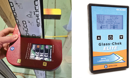
New devices showcased at the Builders' Show make it easy to measure glass performance, u-factor, SHGC, window thickness, and more.


"I have learned so much thanks to the searchable articles on the FHB website. I can confidently say that I expect to be a life-long subscriber." - M.K.
Dig into cutting-edge approaches and decades of proven solutions with total access to our experts and tradespeople.
Start Free Trial NowGet instant access to the latest developments in green building, research, and reports from the field.
Start Free Trial Now


Replies
May I suggest-
A picture on the front page
Reducing the type face so that the reader doesn't have to keep scrolling down
Reducing the number of 'we's. Remember the old marketing adage- nobody likes to be we'ed on. Try to concentrate on the customer rather than on yourselves
John
Were you able to get email addresses with your website? Something like [email protected] gives a much more professional image than [email protected]
I agree with John too, a picture or logo on the homepage would be nice - the first impression doesn't come across incredibly inviting.
On the Condo Remodel page you have a line that says "Click here to see the after photos". It wasn't obvious to me where to click. The picture right above does get you to the next page, but you might want to make the text also work as a link. Most websites allow you to link with both the photo and the text.
Hope this helps,Joe
Couple of things. The site is simply organized, easy to navigate and all of your links work. The only problem I had was trying to send you an email, your address didn't automatically enter in outlook for me (may be a problem on my end). As far as critique goes, the layout is a little too simple. You should pick either a solid background or graphic that has been converted to a gray scale. A logo or picture of a job would be good on the home page to break up all the text. As far as the links go, a buttons are better than text because you don't get the underlining and you can have an image for mouse over, up, and down as well. These buttons are a bit plain, but you can change that just by using a different text color. Lastly, try to hire a pro to take a few pics at a few jobs. Some of those pics are a bit grainy and distorted (like the first of the nautical bathroom). I only took a few design classes at my local community college, but with them I was able to learn how to produce sites and graphics that look somewhat "professionally done". I currently have three sites I manage if you want to see some examples.
Coventry Woodowrking
Bolton Fire Dept.
Jeanette Staley
Jim W.
Coventry Woodworking
PS, I know I haven't updated my site in a long time, I took a break from running my own business to do some soul searching this summer
Edited 12/7/2005 4:41 pm ET by jw0329
Some great comments...thank you! I'm going to rewrite the "about us" page, as well as change the email address (just plain forgot to do it). I know the photo quality is iffy at this point. Believe it or not, until a year ago I was in the photo industry for almost 30 years but the photos I'm forced to use right now are second generation for the most part... I plan to work on getting new scans. What's the saying about the shoemaker's kids? ;)
Thanks for taking the time to give the input!
PaulB
I'd suggest carefully considering whether you ned to have an email address on your website. You might get 'crawled' by a spammer. That's bad enough, but if they start using your address to make it look like you are the spammer you could end up getting hundreds of bounced emails every day. Ask me how I know. I took my address off my website but it was too late
All my serious customers 'phoned anyway
JohnIf my baby don't love me no more, I know her sister will.
Been there John. I wound up having our old hosting company step in but it was a horror. I do tend to think though, that from an image standpoint [email protected] does look better.
PaulB
Here's my thoughts, take them for what you paid for them, and most of what I'm about to say comes from a seminar on websites I attended at JLC Live, so most of the ideas are not my own, though I agree with them
The background on the home page looking like graph paper distracted me I'd try to find a nice neutral color. Add a picture or two as well as some other sort of "graphics" to break up the page, you need something to grab the attention when they first open your page in order to get them to look further. From what I heard at the Seminar was the homepage needs to elicit an emotional response.
What I did like about your homepage was the fact I did not have to scroll down for any reason, everything fit nicely in my screen.
Put your contact information at the bottom of your home page, Name, address, phone number, e-mail address etc. Doesn't have to be huge, this isn't mainly for the customer's benefit, keep the contact page.... What putting your information on the front page does is help search engines find it, they usually scan only the homepage when doing a search, the more information about you, your city, the cities you serve etc, the more likely your page is going to pop up in a search engine query that isn't based solely on your company name.
For example, I just searched, "Remodeling company Hamden CT" and your name didn't pop up anywhere on the first page, while three other remodeling companies in CT did. Most people are not going to look past the first page they see when they do a search.
I don't know what size your home page is, I was told make each page no larger then 100kb in order to make it load quick, 50-60kb is supposed to be ideal. Pictures should be posted that do not require a person to scroll side to side at all,
My own opinion is you should shrink the font size down a bit like someone else mentioned. And add more pictures and graphics, to me the page doesn't "Pop out" at me like I'd like.
I was also told people naturally look for information starting in the upper most right corner and more to the left, then down, back to the left, down, and then to the right, Imagine a large S stamped on your page, start at the top and follow the curve.
I'd also suggest a page of links, one for trade associations you belong too, suppliers you use frequently that are well known in the community, and specific products, make your page a good source for information as well. The more links you have also helps you in the way search engines operate.
My opinion on your photo gallery page, tile the linked pictures across and down the page instead of just a vertical list, it will allow people to see more of your work at once and place captions for what the project is under it. I'd also increase the amount of projects you have listed if you have digital photo's for them, or add more as complete more work and photograph it.
I also you think you need more variance in the colors, they all seem to be a shade of blue, for my eyes that makes everything more or less blend together instead of pop out at me.
Paul,
The simplicity appeals to me. Capitalize "Connecticut", and "President". I proof-read everything, find errors in the Wall Street Journal.
I like your Mission Statement.
Greg
Id like to see some more colors and a logo thats drop dead gorgeous.
Tim
Thanks guys! I'm sincerely grateful for all the suggestions, I'm working on some revisions even as we speak...
(The list of "guys Paul owes a beer" gets longer daily)
PaulB
A picture of the principles would be a good idea I think. Lets people know who they are reading about and who they are contacting. DanT
In your portfolio pages I'd like to see you put more emphasis on the unique / quality items. For example, you mention a glass block bar with epoxy terazzo top and a fireplace; all that the pics show are a fairly generic (and junky - or is that lived in?) game room. Same with the polished concrete counter in the store. Good to have the establishing shots, but show off / highlight the good stuff too!
I hesitate to comment Paul, because I think I am really gonna come across as a jerk
BUT---you did ask LOL.
I don't like the Background---very bland---and the graph paper checks ARE distracting.
The lettering seems to scream at me---almost insultingly.
Perhaps what you were going for was somethin reminicient of job notes written on graph paper?????
If so You need to add some color to the background---something calmer than the glaring screaming white-------- and you need a different FONT----- somthing not all Capitals-----something a little more handwritten ( I actually liked the Font your company adress and phone number is in)
the text of your message---- ya might want to fine tune that a bit---- to me it seems a bit forced--- like you are trying too hard and don't quite have enough self confidence.------------- words like "Peruse"---and " Oft"---- c'mon--- I kept expecting " Bespoke" to pop up somewhere.
tone it down just a bit
the mission statement?------ first off I am always leary of those because they ALMOST always sound forced, contrived and remind me of Dilbert cartoons from the 80's/90's.-------- yours, in combo with the screaming Font seems to drag on--and on--and on---------- so long that by the time I get to the end of it , I can't remember the beginning of it.------- actually---at this point, I can't remember ANY of it's actual content--just the impression that it went on to long---- and I don't think that's what you were trying to get across.
now--- I am really nit picking here---- but the glaring background is repeated in ALL the photos----everything screams Navahoe White--- like there is no other color in Conn.-------- I accept that we don't share the same tastes----but all your projects shown---all look the same to me
the pictures------nothing is close up enough to highlight workmanship---just kind of generic.
you don't give us enough info about yourself and your background----almost like you are deliberately concealing it. You mention published work----but you don't show it or link to it---- perhaps the work is ir-relevant to THIS venture---if so why mention it? If it is relevant enough to mention it--- then you should show it.
Over all, the impression I am left with is that you are a one man band ( nothing wrong with that)----- with limited, if any hands on trade experience( hmmmmm),---who subs out the actual production work( still nothing wrong---but still hmmmmmm), whose design sense doesn't appeal to me personally, again nothing wrong but still hmmmmmm) and who uses to much white paint.
and, again Paul----- I do apologise--- I am sure this came across as excessively nasty---not my intent----but I just couldn't think of any other way to phrase things.
Very best wishes, Stephen
BTW------ you really should check out the links in this thread to Coventry woodworking and to Jeanette Staley. I was REALLY impressed with the photos in those sites---because they showed me what I wanted to see. You are the photo expert, so I am sure that you know technically the difference------- I am just going on my impressions---------- but the Coventry Woodworks and Jeanette Staley photos were much more compelling, much more interesting----had much more of an ability to grab me and make me want to find out more, see more---to buy.
I liked Both the sites a lot--- loved the Coventry woodworking----but most especially the Jeanette Staley web site---- here photos combined with the extensive list of shows, credentials etc.----she clearly has it ALL going on---and she puts it out there.
Perhaps it's just a matter of personal preference--- but I found the work displayed in those 2 sites hugely appealing--- I would want to learn more---about their work and about the characters involved.
Best wishes again, Stephen
Edited 12/8/2005 9:16 am ET by Hazlett
I agree with most of the comments.
We are also a design / build company. Our main souce of income is custom homes.
Check us ourt at http://www.brotherscustomworks.com. All is not finished, still under construction, we will soon add a picture gallery and some other improvements.
We use http://www.godaddy.com for domain registaration and hosting.
Critiques and comments (positive or negative) from ALL would be appreciated.
I am delighted and very grateful with the input from BTers on previous post. Priceless! My future is so bright I gotta wear shades.
Hi Paul,
As a webmaster, graphic designer and marketeer, I have a few pointers for you on your site:
Keep your font size down to 10-12pt and in ariel for readability. Create your site for 600x800 display since that is the typical display most people have their screens set to.
I had to search your whole site to find out you are in CT. As a reader I'd appreciate knowing you are probably not going to do a job for me in Texas up front. Get your name and address, and contact information on top of your home page. Tell us your job location areas.
A background image at 30% opacity will add visual interest on your home page.
Move your thumbnails to the top or left side of the screen. Go to http://www.marketsherpa.com and review their book on landing pages. It shows you how people read web pages and where it's best to put your most important information.
Testmonials for satisfied customers are helpful as is your credability (licenses, awards).
Give them a reason to contact you. A questionnaire about their proposed project for them to fill out and email or fax to you will involve them. Education is a wonderful way to "hook" them. Offer free advice, a booklet, or something useful that they can get for no cost that is educational. If it is of value they will assume you have value too.
Last and most important. What is your differentiating factor? Why should I choose you over another contractor? Use the customer's point of view to answer this. What are typical customer objections-price, jobsite cleanliness, duration of project process, security, etc., answer these on your site to build reliability. Good luck!
Impressive comments. Do me. Please.
http://www.brotherscustomworks.com
My webmaster is busy, can be slow or unresponsive. Critique my site with idea that I may need your help. I submitted a detailed list of changes and additions 4-5 weeks ago, and have not heard back.
Can you provide links to examples of your work?
If you want to keep comments and info private: [email protected].
I'll join in the fray Paul. I've benefitted myself immensely from this exercise and I feel like I owe something back. Sam T was especially helpful as were many others in here.
My first impression was good becauase my browser doesnt' alllow many gadgets to work, so lots of text is best for me. I didn't particularly mind the graph background or the color but the text size was overwhelming. It was so large, I had to check my text size in my tool button on my browser. I was continuously forced to scroll right and left to read a sentence.
The pictures told me more than any words you printed. I discovered that you did some nice remodeling. If you are shooting for upscale remod leads, you might have me calling you.
I couldn't find the "after" picture on the kitchen remodel either. It took me several attempts and when I hit the right button I was actually surprised.
The most important suggestion, other than to get your name and address and phone number more prominent is to rethink your strategy regarding your photo captions. Remember this phrase "facts tell, emotions sell". In every photo, you list facts. You never mention how these facts are going to make life easier or better for anyone. Instead of listing facts of what you did, list the benefits of the improvements.
Example: Our client moved into a newly built home with an entirely unfinished basement. We were able to provide them with a home theatre area, a game room for the children, a glass block bar with an epoxy terrazzo style top, an exercise area and a gas fireplace
The benefits of that finished basement are? Happier children, cleaner basement, more valuable asset, healthier bodies, warmer more pleasant atmosphere, safe place for children to watch television, maintenance free top, etc, etc, etc.
A woman's hot button might be the safety of her children. She'll use that to justify her purchase of the room. The man of the house will ignore that and convince himself that he'll actually use the exercise room.
Mention benefits and you'll have the clients repeating them back to you at the closings. It worked for me.
blue
Thanks for the compliment blue, and taking the time to reply! I'm taking all the comments to heart (have already rewritten some of the copy and added a logo) and it's all very valuable stuff.
Best...
PaulB
There is a misleading apostrophe in the text on the Art Gallery page in the portfolio. "It's" is short for "it is". I don't think you meant to say "Among it is features is a floating wall..."
Apostrophe man strikes again!!!!
I think there are a lot of worthy comments there. Definitely change the font size and drop the all caps. Having to scroll to read everry line will have most people dropping out real quick. The work looks good though. Keep it up!
Lignum est bonum.
Doh... I hate doing that, thanks for the save ;)
"I was also told people naturally look for information starting in the upper most right corner and more to the left, then down, back to the left, down, and then to the right, Imagine a large S stamped on your page, start at the top and follow the curve."
Quite the opposite according to this study:
http://www.poynterextra.org/eyetrack2004/viewing.htm