If any of you can stomach yet another “look at my website please” thread… would you look at my new site? www.berendsohn.us
I’m especially interested in format or nav problems. Mucho Gracias.
PaulB
If any of you can stomach yet another “look at my website please” thread… would you look at my new site? www.berendsohn.us
I’m especially interested in format or nav problems. Mucho Gracias.
PaulB
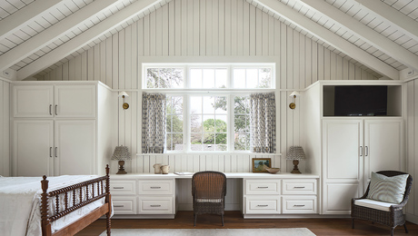
This 654-sq.-ft. ADU combines vaulted ceilings, reclaimed materials, and efficient design, offering a flexible guest suite and home office above a new garage.


"I have learned so much thanks to the searchable articles on the FHB website. I can confidently say that I expect to be a life-long subscriber." - M.K.
Dig into cutting-edge approaches and decades of proven solutions with total access to our experts and tradespeople.
Start Free Trial NowGet instant access to the latest developments in green building, research, and reports from the field.
Start Free Trial Now


Replies
The pictures on the "some of our past projects" seem a bit blury. Once you click through to each project, those pictures are clear.
Yes...I think when you format a thumbnail as a button Frontpage blurs it a bit. I assume that's deliberate, maybe so the photo doesn;'t clash with the text? I dunno... but thanks!
Hi Paul,
Most of the interior pages (the 'past projects' ones) don't work in Firefox; they're ok in Internet Explorer, though. In FF I can see the top text, but nothing else -- no photos, buttons, etc.
I'm guessing that maybe you used something Microsofty to put this together?
Send me an email and I'll help get you up to speed here. I've got some other suggestions as well :)
This is my end of the universe and I'm always happy to help out the crew on this board for all the building knowledge I get here.
Best,
Steve
Tua res agitur, paries cum proximus ardet ~ Horace
Edited 2/27/2007 5:08 pm ET by FatRoman
You must "really" be under construction cause when I clicked into each cover shot nothing opened up inside.
Just said before and after.
"As I was walkin' - I saw a sign there
And that sign said - no tress passin'
But on the other side .... it didn't say nothin!
Now that side was made for you and me!" Woody Guthrie 1956
http://WWW.CLIFFORDRENOVATIONS.COM
...............might help if you tell him what you are viewing it on!
duh[email protected]
WHICH content will be free, of course; WHICH content will require registration; but WHICH content will be available only to members of FineHomebuilding.com.???
Everything worked for me.
In finished projects, the pictures for the basement job are really dim.
On the opening page of finished projects, the cad services button and contact us button are overlapped by the pictures.
I would make the cad services and contasct us buttons about half their size.
On your opening screen, I think your company name needs a different font, or maybe outlined by a rectangle or something.
"Put your creed in your deed." Emerson
"When asked if you can do something, tell'em "Why certainly I can", then get busy and find a way to do it." T. Roosevelt
Thanks guys... I think Andy's problem of not seeing anything is some kind of wierd fluke but the formatting issues are something I'm struggling with (making the layout look consistent from monitor to monitor).
Thanks for taking the time!
PaulB
the pictures and buttons overlap each other ...in all your galleries
.
.
.
, wer ist jetzt der Idiot ?
mad... that's my main problem. They don't overlap (as far as I can see) if your browser window is maximized, that's why I have a message on the first page asking people to do that, but I'm trying to figure out how to make the layout less dependant on screen size. Thanks for the input...
PaulB
.....umm 1024X768
I got the screen as big as I can make it... IE5.
.
.
., wer ist jetzt der Idiot ?
First small thing, on the first page, you've got a black border around the center photo but not the side photos.
Second, do what ever FatRoman says, he knows his stuff.
Also, if you can still fathom a total redesign of the website, check out http://www.coffeecup.com. Their software worked great for all platforms. Quick and easy to learn to.
“The richest genius, like the most fertile soil, when uncultivated, shoots up into the rankest weeds..†– Hume
Paul...still no pictures other than the cover one's come up on my Netscape browser, Just has the wording and before and after w/o photos
"As I was walkin' - I saw a sign there
And that sign said - no tress passin'
But on the other side .... it didn't say nothin!
Now that side was made for you and me!" Woody Guthrie 1956
http://WWW.CLIFFORDRENOVATIONS.COM
Thanks Andy, it must be a Netscape phenomena. I'm using IE7.
I appreciate everyone's feedback!
on my Netscape browser
Good boy!
Go fetch![email protected]
WHICH content will be free, of course; WHICH content will require registration; but WHICH content will be available only to members of FineHomebuilding.com.???
Eric... 'Ole Buddy of mine, does my site work on your computer?
Gimme a ring sometime eh?
Ole Buddy, Oracle...................you gotta an "O" fetish?
Take a look in the morning.
You going to JLC the end of March?[email protected]
WHICH content will be free, of course; WHICH content will require registration; but WHICH content will be available only to members of FineHomebuilding.com.???
Absolutely... I seem to remember first round was on you.
I'm bringing lots of friends.
Mike is buying lunch.............[email protected]
WHICH content will be free, of course; WHICH content will require registration; but WHICH content will be available only to members of FineHomebuilding.com.???
I hear Mike always buys... you know how those hoity toity Rhode Islandahs are.
I'll help.
My first impression was excellent. I like the simplicity and I immediately knew by the pictures that I was dealing with someone who contracts. I got a good feeling by the pictures and layout.
I was slightly dissapointed that I couldn't see the entire page without scrolling and when I scrolled, I was more disappointed that the only thing hidden from my initial screed was one line: the link to see more. I only discovered this after I tried to navigate your site by hovering over everything and then succumbed to scrolling. I'm lazy, I don't like to scroll.
That might be my browser settings, I don't know. I'm using IE on windows XP and I've never adjusted any settings.
The pictures on pg 2 were fuzzy. That is a negative, especially because everything else seems so nice.
I didn't like the webmaster suggestion to make him happy. My internal response is: "Who cares about the webmaster?!!! Why should I care about making him happy? Shouldn't it be the other way around?!!! And, how do I "maximize" my browser window? What does that mean? What does it mean if I don't?" I did hit F11, my favorite method of making the screen bigger but it didn't help, there was still one line hidden and I had to scroll. I felt somewhat cheated, remember, I hate to scroll and every time I scrolled, I found only one more line. I began to think..."Why not make the buttons normal size and fit all this on one line?" Luckily, I"m not a potential client. I might get the impression that you aren't efficient with MY materials either LOL!
The Past projects button is enticing. It's real easy to find with a very nice inviting picture on it. I hit it and found more fuzzy links. Not good but I'm not stopping there anyways. I keep going. Yikes! It took me four times on that page to know that there is more than just the three links!!!!!! When I first checked your site, I tried all three links, past projects, basement pics, and condo remodel and was satisfied. Now, because of this review I know there are a lot more links. REmember, I hate scrolling. All the links could be smaller buttoned and lined up one one page without scrolling.
Anyways, the interior pics were sometimes dark but they were evidence that you do great work. I'd try to tweak the pics in Picassa and lighten them up or whatever.
I hit the contact us button and thankfully it didn't try to pull up Outlook express, which drives me insane. I don't use outlook express and I am extremely fearful of hitting those "contact me" buttons. I would much prefer to see an email address that I could copy and paste into my email program. So,when I hit your contact button I was extremely grateful that you had your address on it and especially thankful that a form didn't pop up that I had to fill out. I don't fill those forms out unless I'm really, really interested in something. Then as I perused your information, I sadly realized that you didn't write your email address in there. I know where your office is and I know your phone and I know your name, but I STILL DON'T KNOW YOUR EMAIL!!! LOL! I have to hit that stupid button again and some program that I refuse to use opens up and I get to cut and paste your infor from that. Nope....I kill the application before it loads. It takes me three kills to get it off my screen...I don't want to register that email program, I don't want to install it, I don't want it on my screen. GET OFF MY SCREEN!!!!!
All in all, it looks like a good site. Simple, easy to navigate. My suggestions are, try to squeeze it all in one pane, without scrolling, if possible. Also, put your email address and all your contact information on the home page, even if its all small print at the bottom. Brighten up some of the pics. I think your website would get me to contact you if I was looking for a contractor.
blue
"...
keep looking for customers who want to hire YOU.. all the rest are looking for commodities.. are you a commodity ?... if you get sucked into "free estimates" and "soliciting bids"... then you are a commodity... if your operation is set up to compete as a commodity, then have at it..... but be prepared to keep your margins low and your overhead high...."
From the best of TauntonU.
Thanks very much for taking the time Blue, I appreciate it very much. One of the other "reviewers" here is a web guru and has given me some very helpful suggestions. I won't thank him by name because I might be responsible for him getting deluged with "government" jobs ;) But, looks like I'll be redoing it for the most part and try try again.
Thanks to everyone who took the time to look it over and post!
PaulB
I would much prefer to see an email address that I could copy and paste into my email program
Please be cautious of this comment. By putting your email address on your site in text format, you open yourself up to spam. Which is much more evil than one man's distaste with Outlook Express. I added my email address in both the dreaded Outlook approach and I also have it in a jpeg - you can read the email address but you can't cut and paste it. It's a picture and not text. “The richest genius, like the most fertile soil, when uncultivated, shoots up into the rankest weeds..†– Hume
Hi Joe,Try this to hide your email address. Copy and paste it right into the body of your HTML page where you'd like the address to appear. It cuts up the address code so that the spam robots that scrape email addresses off of sites can't read it. It will appear on the viewing screen as a link of your name (Joe Madson), so your visitors will be able to click on the link and their email program will start up automatically.If there's anyone else out there that wants to use this, here's what you'll have to modify:"Please send your comments and questions to" -- change that to read whatever you'd like to use as an introduction"var contact" -- change to your name, or whatever you'd like to see printed out on the screen as the link. This is what shows on the page."var email" -- change to the first part of your email address; the part before the '@' symbol"var emailHost" -- change to your domain; the part after the '@' symbolThat's it. You can use it on as many pages as you want. Just copy it into the main body of the page.Any questions, just let me know.Best,
Steve<p>Please send your comments and questions to <script language=javascript> <!-- var contact = "Joe Madson" var email = "joe" var emailHost = "jmadson.com" document.write("<a href=" + "mail" + "to:" + email + "@" + emailHost+ ">" + contact + "</a>" + ".") //--></script></p>
I'm actually Ok with the regular email link that I have - I believe it's just a hyperlink.
In the text of my contact page, I have a line that says "send me an email". The word email is a link to my address. I'm confident that most of the population is Ok with the automatic email popping up.
Based on the feedback of many on this site, I also added my contact info on the first page of the site. I changed my logo to include my phone # and e-dress in the jpeg image.
“The richest genius, like the most fertile soil, when uncultivated, shoots up into the rankest weeds..†– Hume
Hi Joe,Maybe I wasn't clear in my suggestion. You had made a response to Blue about being concerned about spam getting to you through listing your email on your site. Hence the reason for making it an image. But the one on your contact page is viewable by both humans and spam robots. (Humans view the front end, robots read the code).If you implement the code I posted you'll cut off the ability for the robots to read the email address, since it's now scrambled.Best,
SteveTua res agitur, paries cum proximus ardet ~ Horace
Edited 3/2/2007 10:10 am ET by FatRoman
Got ya. I thought I had it beat.
I'll try your way, thanks for the help.
“The richest genius, like the most fertile soil, when uncultivated, shoots up into the rankest weeds..†– Hume
JMadson, good followup on my suggestion. I'm not websavvy so I don't know the dangers of cut and paste text on a site.
Often, I use the properties button to derive the email addresses and cut and paste from them.
The jpg method would be okay with my, as long as it wasn't a complicated address. Remember....I'm lazy, especially when it comes to websites. I click out of ten websites for every one that I continue on it. When the active x and java and popups start....I'm history.
blue"...
keep looking for customers who want to hire YOU.. all the rest are looking for commodities.. are you a commodity ?... if you get sucked into "free estimates" and "soliciting bids"... then you are a commodity... if your operation is set up to compete as a commodity, then have at it..... but be prepared to keep your margins low and your overhead high...."
From the best of TauntonU.
I took a look through Mozilla and Safari. The pics work in Safari, but some of the text overlaps the pics.In Mozilla nothing comes up when I click the thumbnails.That's one clean looking website<g> "But to be honest some folks here have been pushing the envelope quite a bit with their unnecessary use if swear words. They just put a character in to replace a letter. But everyone knows what they're saying." Sancho
just out of curiosity, why not have the link go right to the homepage? rather than have the visitor click to enter the site? i admittedly don't know much about webdesign, so if there's a good reason, i apologize in advance
None at all... (good reason that is)... it's on the ever growing list of revisions ;)
PaulB