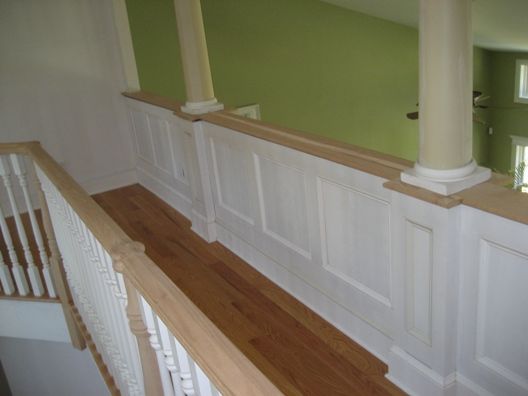
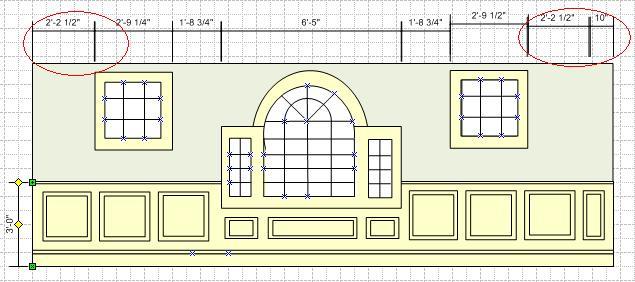
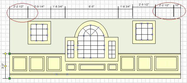
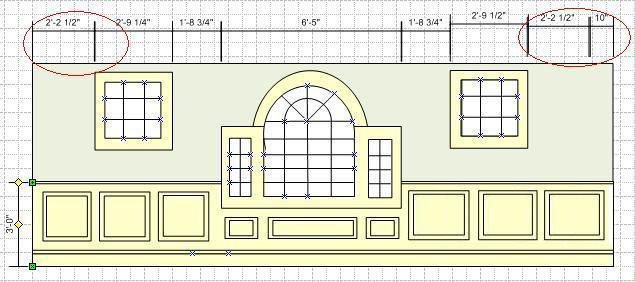
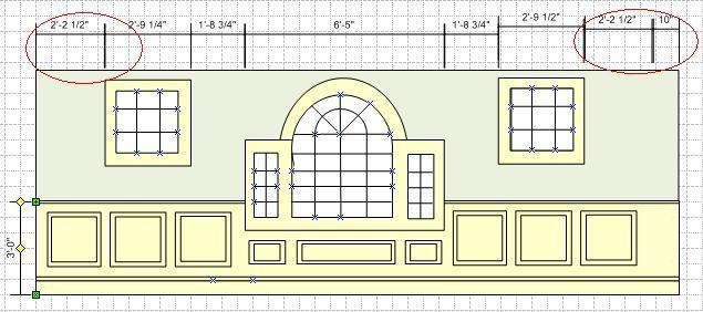
Hello all. I am paneling the hall in my own house and have a layout issue/challenge. For reasons beyond control, one hall layout is asymmetric with regard to open space between the end windows and the edge (wall on one side, closet on the other). In the attached images, I’ve included a shot of an existing wall that I did as well as the wall in question with 4 options. You’ll see the problem highlighted in red. The space between the window on the right and the edge is 10″ more than the window on the left and it’s edge.
I know folks will say this is a preference but I am interested if anyone has theory behind the choice. I’ve read here that all panels along a wall should be the same size. I don’t know if that accounts for a situation like this.
Below are the options I can think of:
Option 1 is to have an extra panel in the 10″ difference.
Option 2 is to make the rightmost panel larger to make up the difference.
Option 3 is to make the 3 panels to the right of the palladian window equal in size but they will be larger than the 3 panels to the left of the palladian window.
Option 4 is to make all the panels equal with and just make an extra-wide stile on the right of the panel assembly.
I’m leaning to Option 3 or 1. Option 2 looks real funky.
As always, thank you in advance for your input.
-Jonathan


Replies
Well, I'll give you my potentially stupid shoot-from-the-hip sort of answer just to get you started--build a ten inch wide column or half column to account for the difference! Even though there really isn't a column, it will cause the viewer to see a reason for the difference and (hopefully) ignore it. That's my take, anyway! (Pretend it's a pipe chase or something!)
Try drawing it with the stiles and the panels a little larger on right side.
3
[email protected]
>"Option 3 is to make the 3 panels to the right of the palladian window equal in size but they will be larger than the 3 panels to the left of the palladian window."
Yup, they will be a different size than the panels on the other side.
And if you do it right, no one will notice.
Ever.
Clearly you should sue the framer for not putting the window in the right place.
I would choose # 3 of your choices, but I like Danno's idea of a fake column in the corner.
"Put your creed in your deed." Emerson
"When asked if you can do something, tell'em "Why certainly I can", then get busy and find a way to do it." T. Roosevelt
"Clearly you should sue the framer for not putting the window in the right place."
I don't know what the nuances are of suing oneself so I'll just focus on the trim. I'll have the same issue if I decide to go after the architect. :)
Actually, the window is in the right place and from the outside, everything is symmetric. These windows are in a hallway that carries on to the right of the image. If there was a corner on the right then I'd look at the half-column but it's the start of a closet.
I think #3 is the way to go.
Thanks everyone for responding!
I think Danno's option is the best. Do something different with that extra 10 inches. make a floor to ceiling panel or a false column.
Mo,
I don't have a suggestion but what caught my eye was how the panels line up (or don't) with the side windows. Maybe there's another option that would trick the eye there also.
Beats me, best of luck.
A Great Place for Information, Comraderie, and a Sucker Punch.
Remodeling Contractor just outside the Glass City.
http://www.quittintime.com/
Cal,I noticed that as well. . . Another thing to consider is not to make the panels on the left square as your eye will pick up the difference that the ones on the right are rectangular. Make the panels on both sides rectangular and that will go a bit further in fooling your eye.http://www.josephfusco.org
http://www.constructionforumsonline.com
Option 5,
keep the left as you have it. divide the right into 4 equal panels.
dont screw with the size of the stiles. people will notice if a stile is a half inch narrower but will never pick up a 2 inch difference in a panel
I agree with keeping the stiles sizes consistent (3.5" in this case). Here is Option 5:
much better
just for laughs try 4 panels on the left and five on the right
Here is Option 6. Interesting.
I think option 6 washes well with the eye. that would be my choice
since you have the capacity lets try 5 and 5
I'm starting to think maybe you are goofing with me! Here is number 7. It does bring the aspect closer to the golden rule than I started with the square boxes.
Best of all, #7.
I do a lot of raised panel wainscoting. most of my runs are made up of panels between 14 and 22 inches. the thing that I've found is the smaller the panels the less likely you are to notice a difference.
2 next to 3 stands out like a sore thumb. 5 next to 6 is much less noticeable. making them all the same then filling in with a noticeably smaller panel looks like a store bought screw-up
sometimes when moving an electrical outlet or central vac port is not an option I will make one panel in a run larger or smaller by a couple of inches. if I never pointed it out no one would ever notice
i thought these guys were crazy for recommending too many panels but I have to say now that I've seen it, it looks better.
Is there a common denominator? a size that goes equally into both wall sections?
See, and we told our teachers we'd never have to use that kind of stuff in real life.
<!----><!----><!---->
I refuse to accept that there are limitations to what we can accomplish. Pete Draganic
Take life as a test and shoot for a better score each day. Matt Garcia
Ok, now what about the panels under the main window? Should they all be the same size?"Put your creed in your deed." Emerson
"When asked if you can do something, tell'em "Why certainly I can", then get busy and find a way to do it." T. Roosevelt
Changed my vote
#7[email protected]
definitely #3, especially if this is a hallway where it would be difficult to step back far enough to actually see the difference. I might think differently if this were the main wall in a formal great room.
Make all panels the same size but narrower. You will wind up with one more panel on one side but equal in size.
mike
I like that idea--with the other solutions, there is something about different sized panels and the stiles between that bothers me.
When i'm faced with that problem I choose number three.
The window visually breaks up the wall, so in my opinion it works out fine.
Family.....They're always there when they need you.
I would go with a version of number 3 if this wall is in a hallway. If I am picturing this correctly, it will be hard to notice the difference without being able to stand back a significant distance from the window wall.