Took a little time today, and went back to work on my website. Bring it on.
http://www.grantlogan.net/index.html
Birth, school, work, death…………………
Edited 10/19/2005 3:34 pm ET by seeyou
Took a little time today, and went back to work on my website. Bring it on.
http://www.grantlogan.net/index.html
Birth, school, work, death…………………
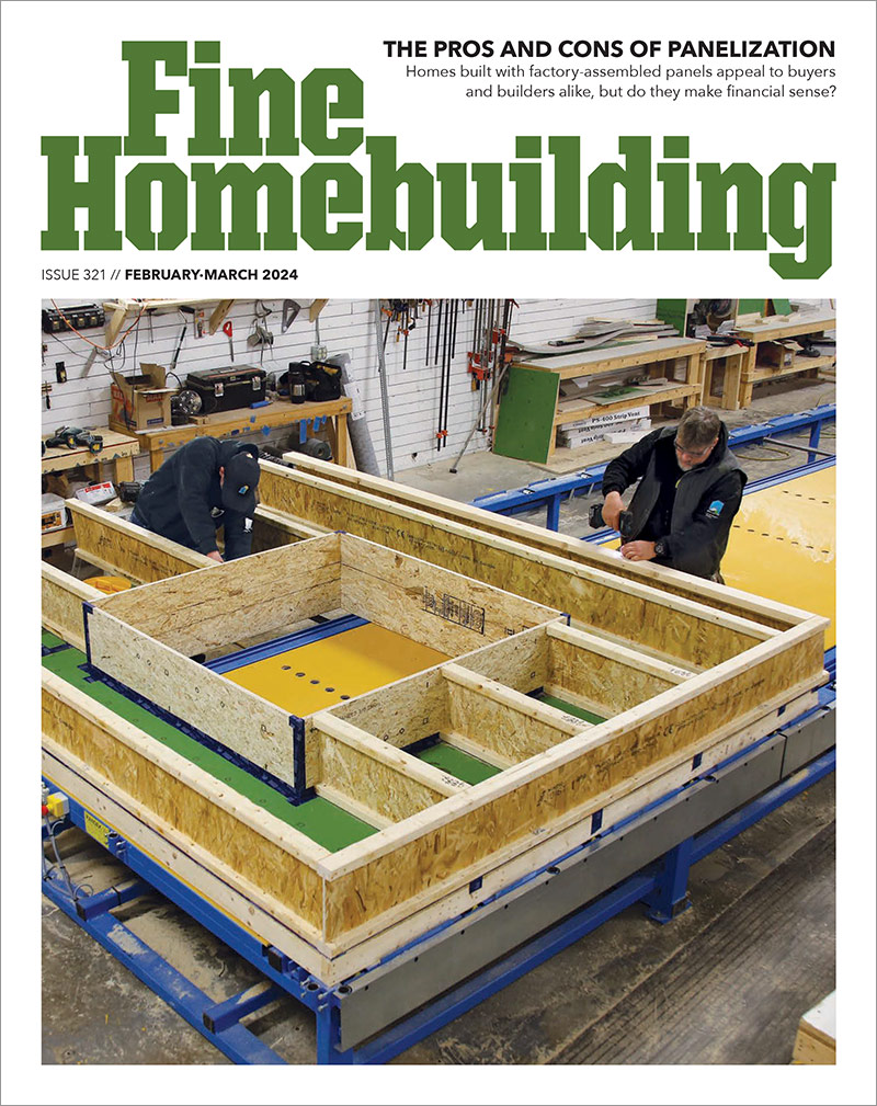
By considering things like energy-efficient mechanicals, window orientation, and renewable energy sources, homes can be evaluated to meet the energy codes. Here's what the IRC has to say.


"I have learned so much thanks to the searchable articles on the FHB website. I can confidently say that I expect to be a life-long subscriber." - M.K.


Replies
None of your links work.
It's a dead page.
Yeah - all I've got done is the current page - I'm workin' on it.Birth, school, work, death.....................
OK, one of the links works now............................Birth, school, work, death.....................
Hey Grant, I think it looks pretty classy. Nice picture. Still doing it on your own? "what's in a name?" d'oh!
Yup - Thanks.Birth, school, work, death.....................
At 26,4 dial up, the link loaded in less than 10 seconds.
Spheramid Enterprises Architectural Woodworks
"We adore chaos, because we love to restore order"
Mauriets Chavailier Escher
I would probably eliminate the "a limited liability corporation" because you have the LLC just below it after your name. Also, to me it emphasizes gutters and not roofing, is that what you want?
Also, to me it emphasizes gutters and not roofing, is that what you want?
Not neccessarily, but we do about as much of one as the other and built-in (box) gutter and custom profiles are a specialty. I average a little better profit margin on guttering, so that might not be a bad thing.Birth, school, work, death.....................
I like the photo. What was once a simple dwelling now exuding integrity through both the original masonry and that well executed classy roof.
A couple things that others noted earlier struck me too, and that was without having read their comments:
- Consider using only "LLC" instead of the full Limited Liability Company.
- Are you emphasizing all copper work or mainly gutters? The wording struck me as in contrast with what the photo first conveyed.
I can read the text but I'm sure some will have difficulty. I'd go with a darker color if you keep the same backgrounds. Looking better. Nicely condensed, but could be positioned higher on the page.Good readinghttp://www.visibone.com/colorblind/
I can read the text but I'm sure some will have difficulty
I'm trying to be subtle. I've mimicked a site that I think looks good. It looks great on my office monitor, but I concur with you when I view it on my home monitor. That's why I ask you guys. Thanks. I'm stil tweaking.Birth, school, work, death.....................
http://www.grantlogan.net/index.html
Been doing some updating.
I'm not done, yet, but I hope I'm going in the right direction.
Birth, school, work, death.....................
Looking good . on my PC, the pic on the home page is still a bit dark.The spire on the Contact us page is awesome! I think it's probably better having the home on the main page, to get the broadest appeal, but if there is someway to work the spire in on the main page. (see below)Also, the page size is somehow set in the code, and doesn't adjust depending on the visitors screen res, which lead to some choppy effects. at 640 res (see attached screenshot images) the page is cut off at the right; at 1024, the populated part of the page is too small; and even smaller at 1208I played with a way to get the cupola pic in on the main page in the 1208 res image (WithCupola.jpg)Another idea would be to use a small version of the cupola as a "home" button, or something, and have at least 1 page with it boldly displayed large.Is there some w
View Image
Sojourners: Christians for Justice and Peace
Yeah, thanks , Bob. I simplified the home page from my previous one because of loading time complaints and tried to get it all above the "fold". I'd thought of doing something similar.Birth, school, work, death.....................
Looks real nice from here. Better than before and quicker without question. Can't find much to pick on besides what's been offered. Light text (a bit), LLC and the choppy pictures. Actually I noticed two links at the top of the page were not underlined, assumed that is because they aren't linked to anything yet. Don K.
EJG Homes Renovations - New Construction - Rentals
The size of the photos (at least on the main and contact pages) is being adjusted by the browser. That isn't giving you the best quality nor the best load time. It would be best to resize the photos you placed online to the sizes specified in your code. If you need help on that, I can resize them for you.
On my monitor the house also seems too dark, but that may just be my settings. What is everyone else seeing?
kestrel
It would be best to resize the photos you placed online to the sizes specified in your code.
I've done that on the main page and will later on the others. I got them close and let the browser take them the rest of the way 'til I had more time to spend.
I've looked at 4 monitors and one seemed dark. The other 3 were about right. I lightened it a little.
Thanks for the input.Birth, school, work, death.....................
What tool did you use to develop your site? You are using homestead.com to develop? If so, be aware that your code is dependant on the existence of homestead.com continuing. Much of your code links back to them.
Do you actually own the code for your site? i.e. Can you take it with you and go to a new host?
Yeah, I'm using homestead to develop. This is a trial run on the cheap. I'm not completely sure where I want to go with this site. I've had several business plans previously and they haven't worked out quite as I had expected. Two years ago, I had very little competition, but now there's upstarts coming after me hard. I may take a hard left hand turn and blaze a new trail shortly and let the new guys fight it out amongst themselves.Birth, school, work, death.....................
I like round 2 better.
Is there any way you could sandwich the text between the spire pic (on left) and stone house pic (on right)? The stone house pic is a great pic, but just doesn't scream 'copper' to me as much as the spire pic. I realize you might be suggesting the weathered copper appearance, but I'd also push the shiny stuff. See attached.
As a couple other folks mentioned, the text is a bit light. The "G" and "N" really stands out. Are you going to encorporate that into your company logo? Really makes GN stand out.
The text is a bit redundant. I trimmed it in the attached.
View Image
Looks good, Grant. Let me know if you want a Flash (Macromedia, that is).
jt8
"Real difficulties can be overcome; it is only the imaginary ones that are unconquerable. " --Theodore N. Vail
Edited 10/22/2005 11:40 pm by JohnT8
I'm taking your and Bob's advise. Thanks for the input. I may consider doing something with Flash.Birth, school, work, death.....................